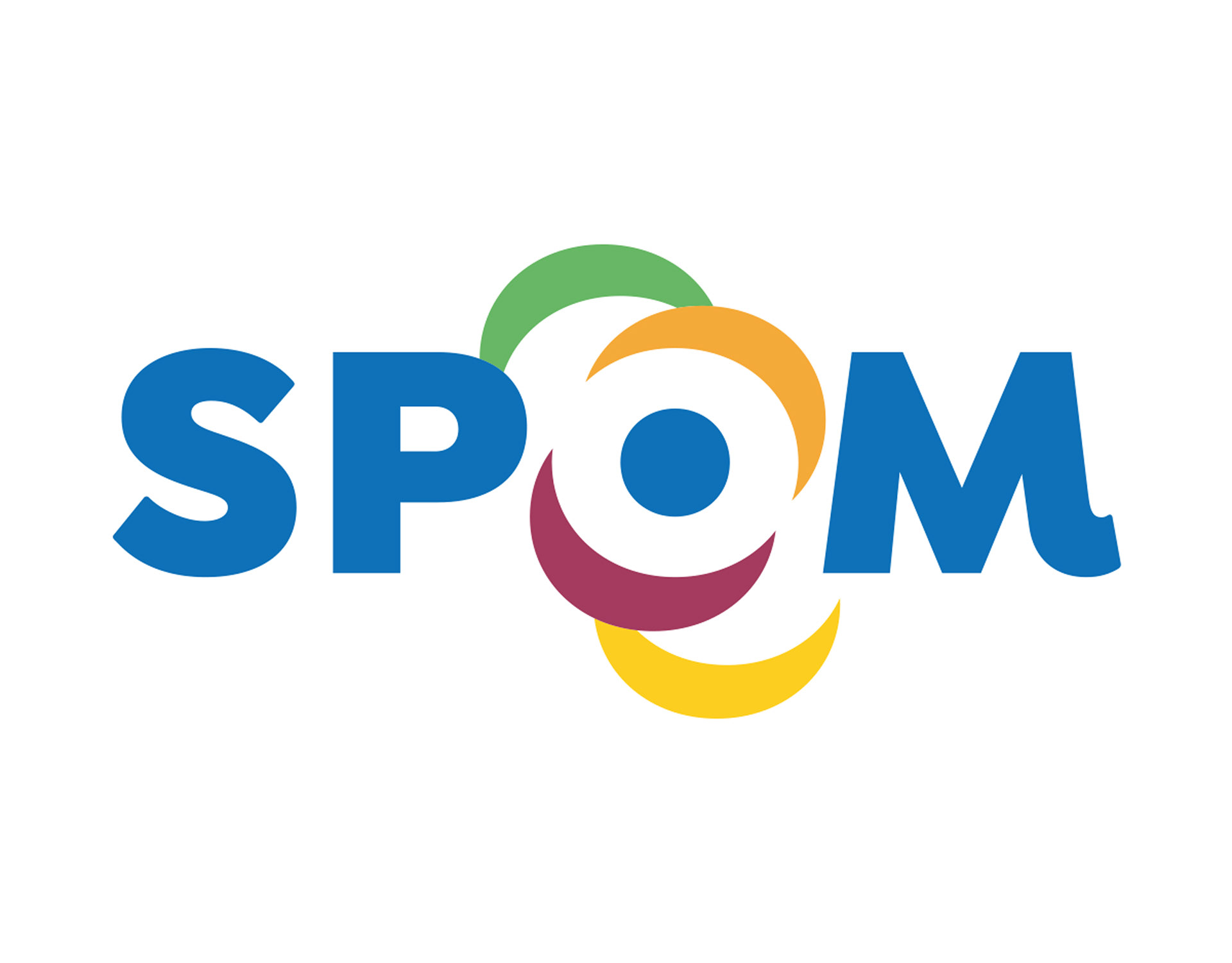
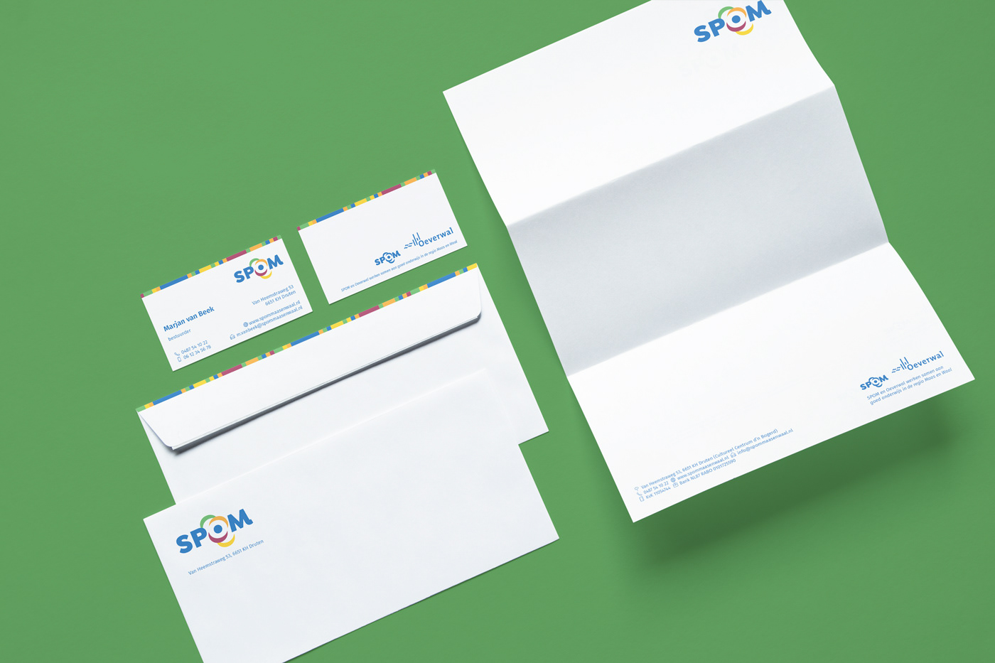
SPOM (Stichting Primair Onderwijs Maas en Waal) is a foundation of several primary schools and childcare centers in the Netherlands. The letter O stands out most in the this logo. The O stands for onderwijs (education) and opvang (child care), but also for the Dutch words for development, and openness - both starting with an O. If we look further at the O, we see that this letter is created with the use of white space. This is a metaphor for the space that the child needs in order to develop. The blue dot in the middle represents the child: the child is literally the central point. Several petals are placed around the white space. Each with its own color and identity, that together form a whole. The petals are a reference to growth, and stand for the teachers and the parents, but also for the various schools that are connected to SPOM.