The name siMOn might suggest that the first name of the founder of this company is Simon. Nope! siMOn stands for Management & Development ('ontwikkeling' in Dutch). It is however a reference to Arianne Simons, an experienced management consultant trainer / coach and manager. The clean style, with an artistic angle perfectly fits her personality and professional style. The logo is often used mirrored on the different expressions, as a metaphor for the work that Arianne does. After all, she always holds a mirror to people and organizations.
siMOn branding
Branding for siMOn
You may also like

Forzes branding
2018
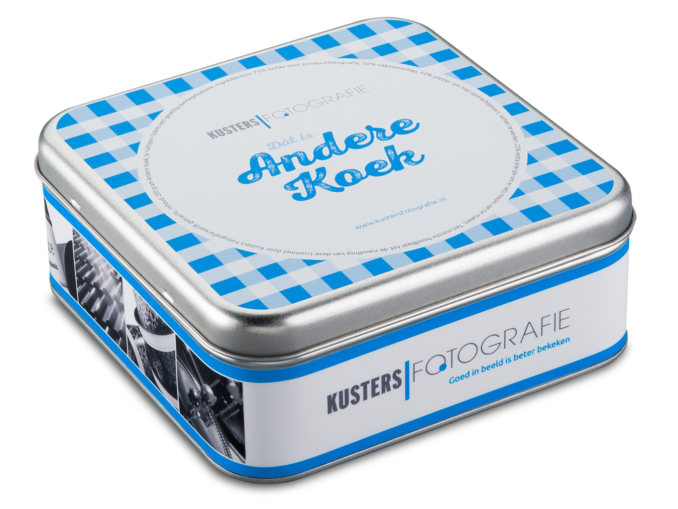
Biscuit tin for Kusters Fotografie
2017

Jolande
2021
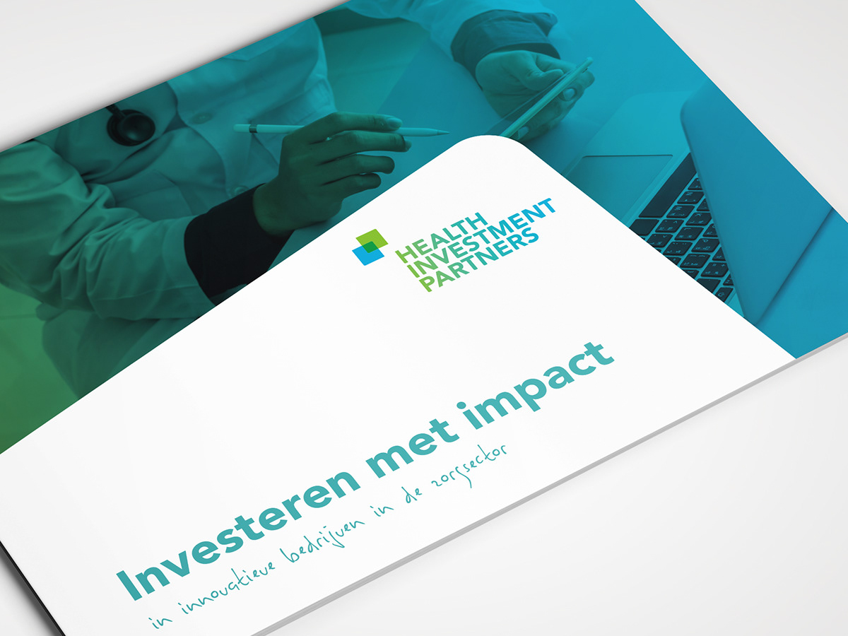
Brochure Health Investment Partners
2017
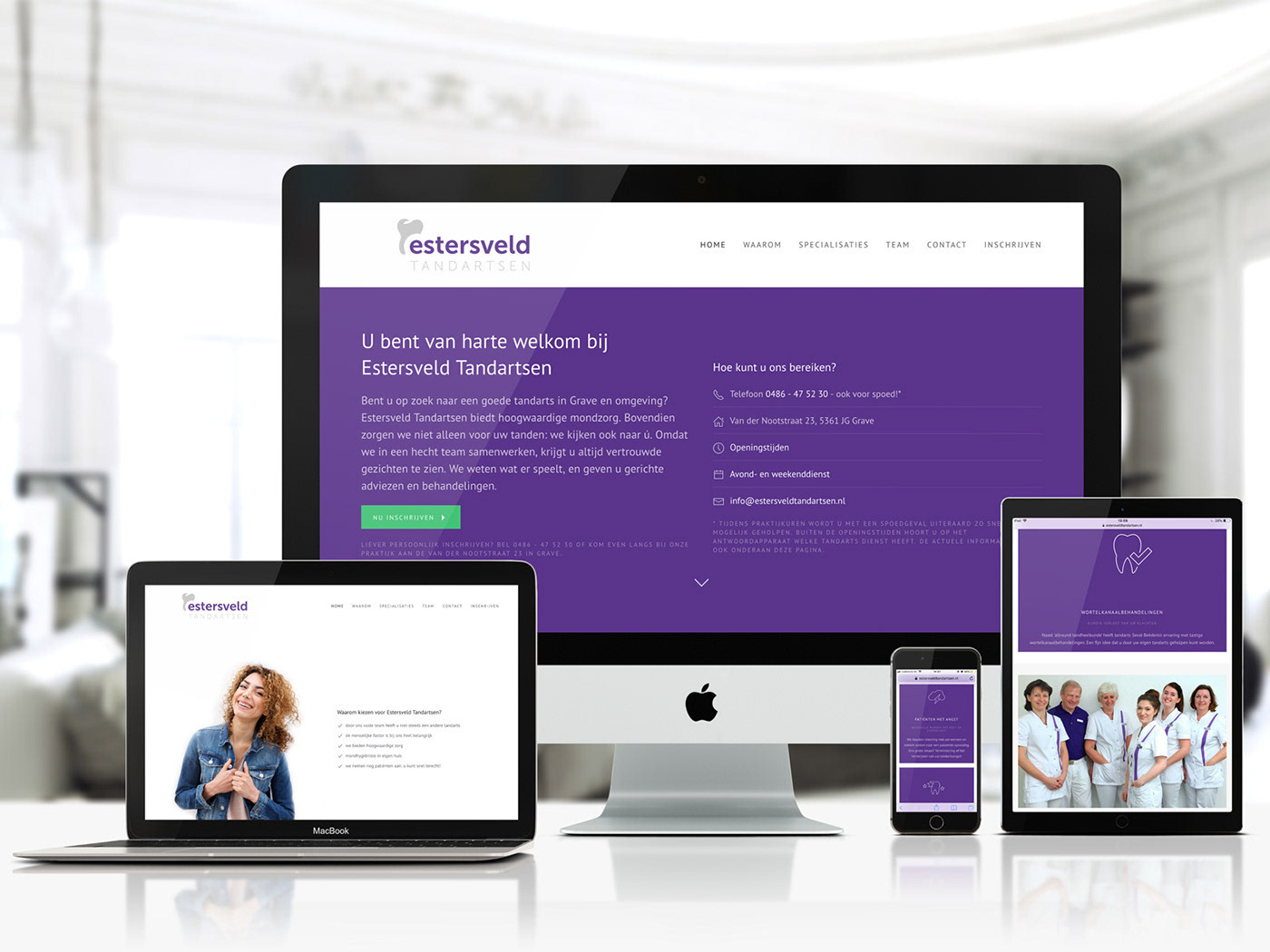
One page WordPress website for dentist practice
2018
Branding AM Kwadraat
2018

Product folder with cake recipes
2018

Flyer for Futura School International Language Studio
2018
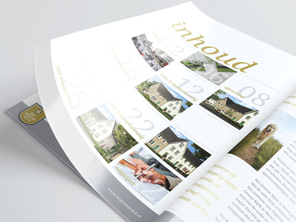
Brochure real estate project 'Het Groene Rijck'
2015
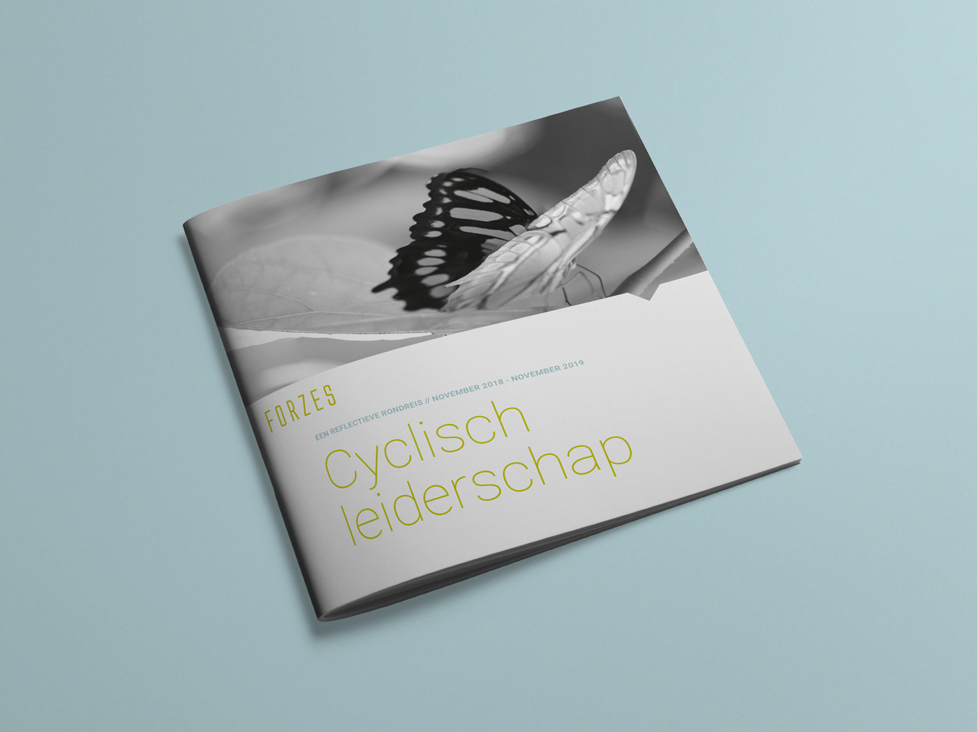
Brochure leadership programme
2018
